Table of Contents
Components seen on Page 1
|
|
Two Column Content Block Comp
Image/Text
Image/Image
Icon w/ Title, Copy, and Links
Video w/ Caption
Allsteel's newly renovated Boston showroom.
Image
This component will just add an image onto the page.
Statement of Line
Statement of Line

Overall
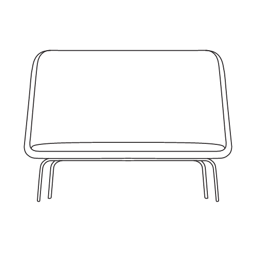
48½"h x 63"w x 27"d
Seat
18"h x 55¼"w x 19⅜"d
Back
32"h x 63"w

Overall
32"h x 63"w x 27"d
Seat
18"h x 55¼"w x 19⅜"d
Back
17½"h x 63"w

Overall
48½"h x 31½"w x 27"d
Seat
18¼"h x 27"w x 19⅜"d
Back
32"h x 31½"w

Overall
32"h x 31½"w x 27"d
Seat
18¼"h x 27"w x 19⅜"d
Back
17½"h x 31½"w
Image Overlay Products
This is the component that the Drupal Media Library leverages to allow the user to tag products for images.
Resources Section Group Content
The Resources Section Group is only used on the Product Details Page.
Rich Text
This is our text editor and can accept different typefaces.
Lorem ipsum dolor sit amet, consectetur adipiscing elit, sed do eiusmod tempor incididunt ut labore et dolore magna aliqua. Ut enim ad minim veniam, quis nostrud exercitation ullamco laboris nisi ut aliquip ex ea commodo consequat. Duis aute irure dolor in reprehenderit in voluptate velit esse cillum dolore eu fugiat nulla pariatur. Excepteur sint occaecat cupidatat non proident, sunt in culpa qui officia deserunt mollit anim id est laborum.
The Importance of PlaceCurating settings that enhance individual performance and collaborative engagements is one way to amplify the human experience. Another way requires evaluating how/where/when employees do their best work and accommodating an expanded range of choice. |
Navigating Meaningful ChangeWe help our clients envision all the ‘What Could Be’ scenarios where space adapts with the changing nature of work – in a much simpler, more organized, and less challenging way. |
Allowing for Continuous WorkflowWe refer to easily accessible, dedicated team spaces adjacent to solo spaces as workplace neighborhoods. Much like neighborhoods in your own community, these defined areas within the floor plate exemplify unique characteristics that set teams apart. |
The Workplace EcosystemWhen we mention the ecosystem, we’re referring to all the interactions and places where work happens today – whether that’s the office, a library, park, or coffee shop. An organization’s culture and its people define what that ecosystem is. |
Digital Equity in the WorkplaceTechnology is constantly evolving how we interact, work, live, and play. Now more than ever, organizations should embrace tech-enabled spaces and carefully consider ways to close any digital equity gaps for hybrid/remote workers. |
Video
This just adds a Video into a page.
Title and Link
Title
Featured Symbols
This only appears on the 2D/3D List page when coming to the page through the unfiltered path
Links with Title
This component is used with other components and should not be used on pages.
Surface Materials Docs and Links
This component is used for the Textile and Finish CT to display links to documents or other pages. Should not be used on pages.
Surface Materials Documents
This component is used for the Textile and Finish CT to display links to documents or other pages. Should not be used on pages
Image/Video Thumbnail Gallery
This will only display on the Product Detail Page.
Cinegram
Ability to add a video animation loop with or without audio to bring life to pages or highlight features of products
Hotspots
Ability to add hotspots on 2d images / floor plans and provide link to finishes/products shown in the image
Matterport/Yulio Integration on Site
Ability to add a matterport virtual tour onto pages on the site.
IN DEVELOPMENT
Project Folders
Information soon will also be able to be saved and added to project folders from components as well. And these collections can be preset on our side so if user scans an application or product they are interested in at a showroom as an example they could be taken to a collection that shows the idea starter, the specific products they liked, swatches of the materials, literature – so that they can refer back to this or share it with others (or request physical samples sent)
Table of Contents
Components seen on Page 1
|
|


